Revolut's ATMs

Timeline
Roles
Metrics
Overview
Revolut’s ATM network is part of the company’s physical presence strategy: designing the experience of the next generation of ATMs in Europe. My role was end-to-end UX design—from the customer-facing kiosk to the backoffice that manages the network—and setting the foundations for a brand new medium for Revolut by borrowing patterns from both Web and Mobile while fitting the constraints of a large, tactile, public screen.
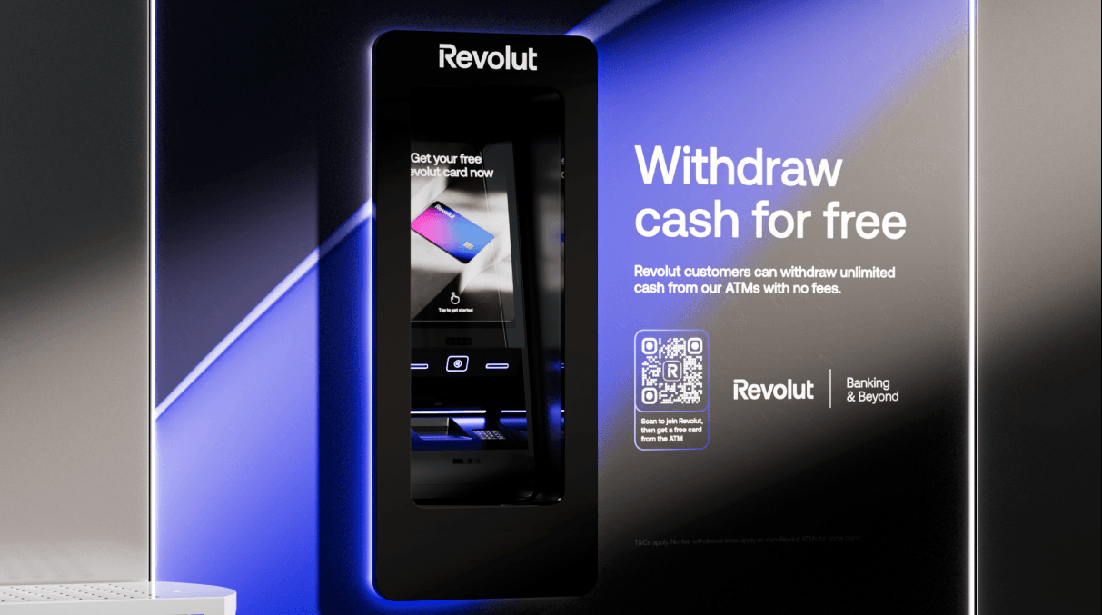
The product launched in Spain with plans to expand across Europe. Users can withdraw and deposit cash for free, get a Revolut card from the machine, and use contactless support, in a sleek, branded experience.
The opportunity
Revolut, the team, and stakeholders
Revolut is a British multinational neobank that offers services for individuals and businesses in over 48 countries. Launched in the UK in 2015 with money transfers and exchange, it now has more than 55 million customers using dozens of innovative products. ATMs are a physical extension of that product: they had to feel consistent with the app and brand—simple, fast, trustworthy—while serving users in short, often time-pressed sessions.
The core team was small and cross-functional: 1 Product Manager, 1 Product Designer (me), 9 Engineers, 5 Ops Managers, and 2 Business Developers. Stakeholders included CEO and CTO, Legal, Fincrime, Creatives, Mobile, and partners such as Visa and Mastercard. Aligning all of them on scope, compliance, and brand was part of the design challenge.
Why Spain, and why ATMs
We framed the opportunity around two main themes: why Spain, and why ATMs are ripe for change.
Cash is still strong
Spain remains one of the most cash-reliant economies in Europe, with cash representing over 60% of payments according to the Bank of Spain. It’s also a market where Revolut’s digital services already have strong traction, with nearly 5 million customers. So the need for cash and the relevance of the Revolut brand were both clear.
An outdated market
ATMs have barely evolved and still often feature clunky interfaces, hidden fees, poor exchange rates, and limited functionality. A big part of that is legacy technology, which limits how much better the experience can get. That gap was our design space.
What users told us (trust and NPS)
Beyond general NPS (which we could track by country and city), we looked at the “Factors Deep Dive: categorisation of responses” in customer surveys. User quotes made the themes tangible: “I’ve had issues with a product/service being unavailable when I needed”; “I worry Revolut doesn’t have a physical office, representation in my country, local IBAN”; “Fees and conditions are not transparent”. Addressing these through a visible, reliable physical touchpoint was part of the strategy.
What we set out to achieve
We defined clear objectives and how we’d measure them:
- Launch in the Spanish market — starting with 50 ATMs in Barcelona and Madrid.
- Increased brand awareness and consumer trust — measured with surveys before and after.
- Revenue from transactions — to offset CAC and support the business case.
- Increased sign-ups via the machine — tracked via QR code and activated cards.
Laying the foundations
Before detailing the UI, we had to lock in regulatory constraints and hardware foundations.
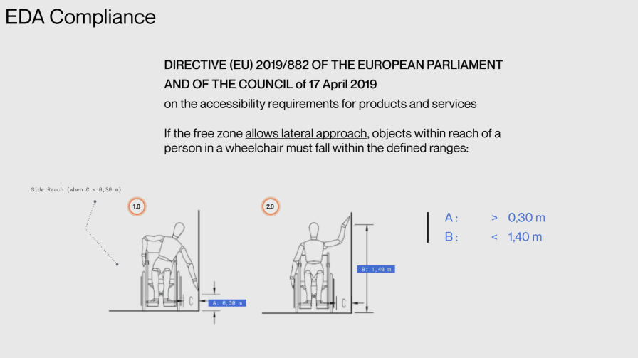
Accessibility first (EDA compliance)
We designed for the European Accessibility Act (Directive (EU) 2019/882 on accessibility requirements for products and services). For lateral approach by wheelchair users, interactive elements had to fall within defined reach ranges: horizontal clearance A > 0,30 m and vertical reach B < 1,40 m. We also defined the operational area (screen, card reader, keypad, cash vault) and advertising area, with overall height in the 2,05–2,15 m range and clear space in front of the machine (< 30 cm toe/knee clearance) so that the ATM could be used comfortably by everyone.
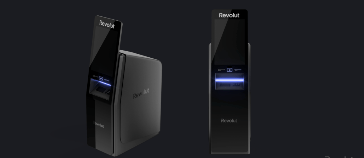
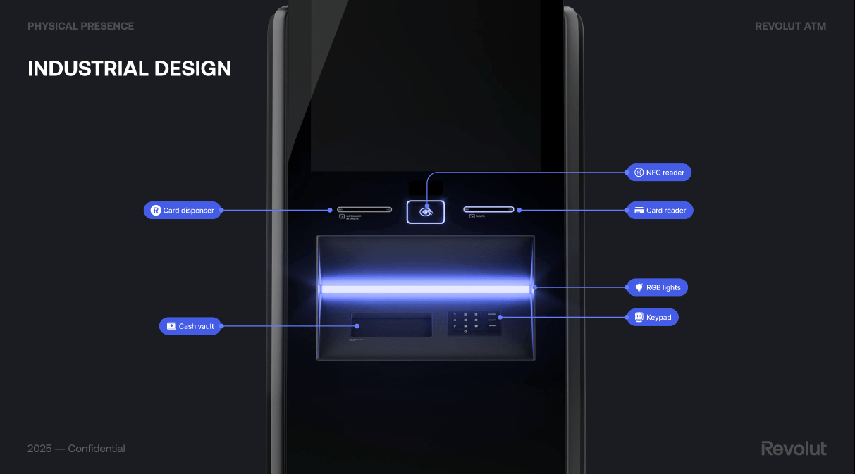
Industrial design: the machine and the screen
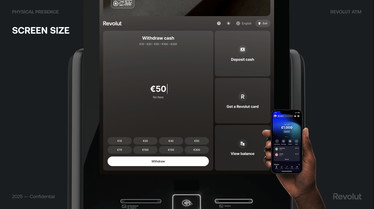
The hardware had to feel like Revolut: sleek, dark, with clear zones for screen, card reader, NFC reader, card dispenser, keypad, and cash vault. The main screen is a large multitouch display (1920×1080 px, 68 ppi), and we used RGB lighting for feedback and wayfinding. We compared our screen size and density to a typical smartphone (e.g. iPhone) to make sure we weren’t just scaling a mobile UI—the ATM is a different context and needed a dedicated layout.
Screen size and density: not a blown-up app
The ATM screen is large (1920×1080 px, 68 ppi, multitouch)—very different from a smartphone. We explicitly compared it to a typical phone (e.g. ~5.4” display, much higher pixel density) to avoid the trap of scaling the Revolut app 1:1. The kiosk is used at arm’s length, in a standing position, often in a hurry; we needed a dedicated layout, larger touch targets, and a clear hierarchy so the experience felt native to the machine, not a blown-up app.
UI components and patterns
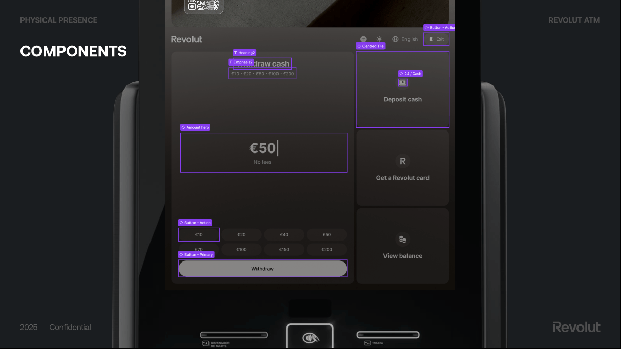
We defined reusable components for the main flows: a clear amount hero and quick-amount buttons for withdrawal, a primary action button, and secondary tiles for Deposit cash, Get a Revolut card, and View balance. For receipt we kept it optional: “Do you need a receipt?” with “We will send your receipt via SMS”, then Send receipt or Skip, so we didn’t add friction for users who didn’t want a receipt. These patterns were documented so the UI stayed consistent across flows and future markets.
Aligning with the Revolut app
The ATM had to feel part of the same ecosystem as the Revolut app. We referenced the app’s patterns—accounts, balance, language selector, exit—where it made sense, so existing customers felt at home while we still optimised for the physical, single-session context. That balance between familiarity and kiosk-specific design was a constant in the foundations.
The experience
What the ATM does
The Revolut ATM experience centres on a few core actions:
- Free cash withdrawals and deposits
- Card dispensing — get your Revolut card from the machine
- Contactless support — tap to get started
- Sleek, branded design and intuitive interface
- Advanced security features
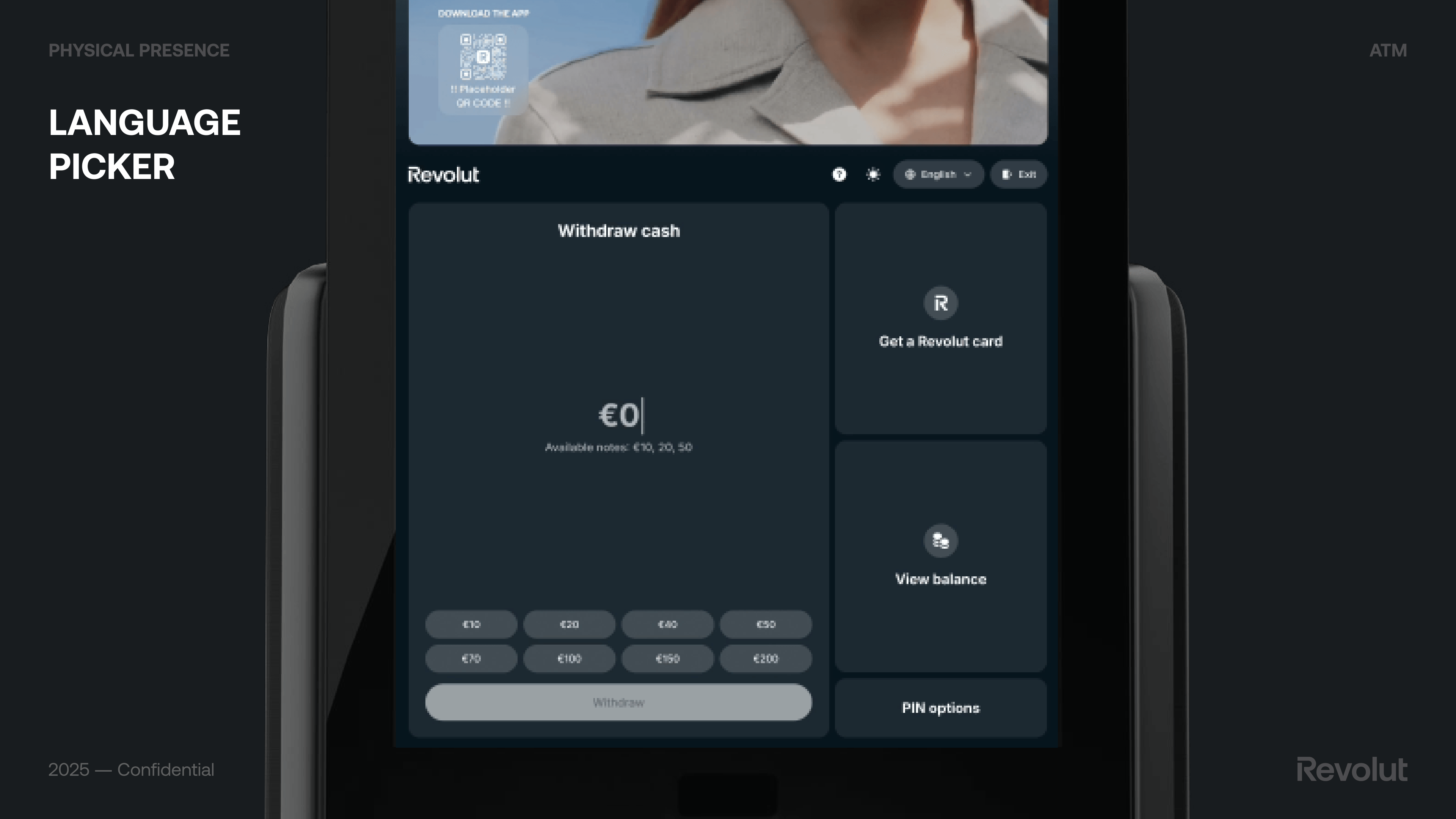
The main screen offers quick access to Withdraw cash, Deposit cash, Get a Revolut card, and View balance, with clear denomination options (e.g. €10, €20, €50, €100, €200), “No fees” messaging, and a primary Withdraw action. We also designed flows such as receipt via SMS (optional, with “Send receipt” or “Skip”) so that the experience stays simple and consistent with Revolut’s transparency.
From concepts to final design
We explored several concepts for the home screen and withdrawal flow.
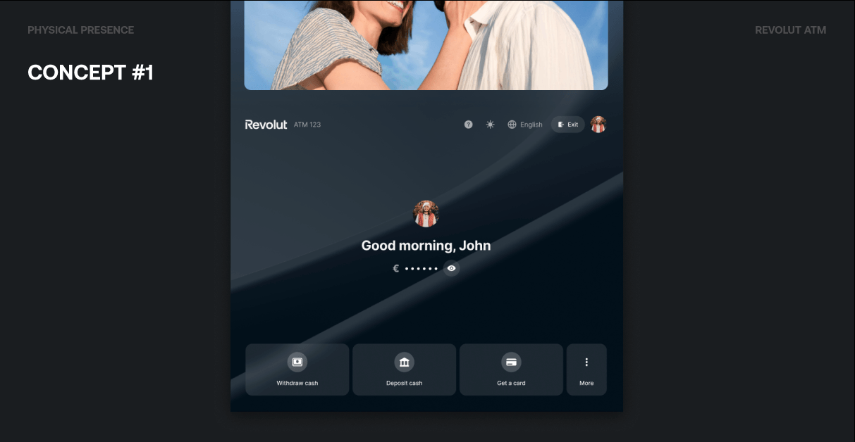
Concept #1 focused on a personalized welcome (“Good morning, John”), quick access to balance (with a privacy toggle to show or hide the amount), and an easy-to-access toolbar for Withdraw cash, Deposit cash, Get a card, and More.
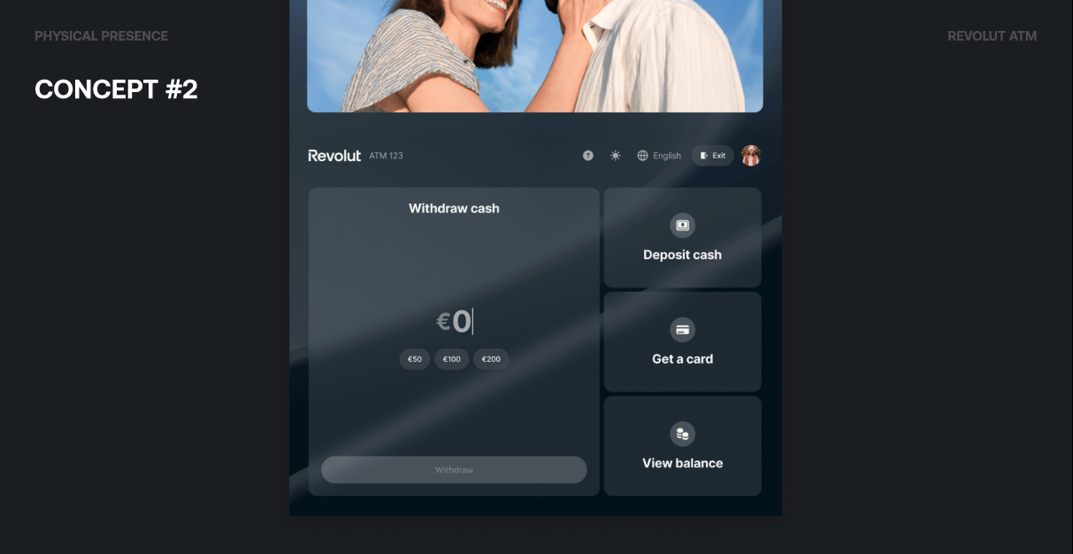
Concept #2 put Withdraw cash upfront with a large amount input (€0 and quick options like €50, €100, €200) and a Withdraw button, while keeping Deposit cash, Get a card, and View balance as secondary actions. We experimented with default app wallpapers, user picture customization, and glass-like blur effects to make the ATM feel closer to the Revolut app without copying it.
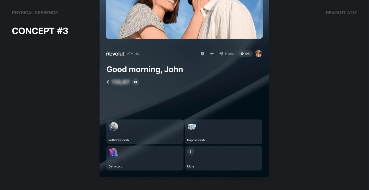
Concept #3 used a 2×2 grid of primary actions with an app-like hide effect, a left-aligned, more modern look, and bigger buttons leveraging 3D icons for better visibility and touch.
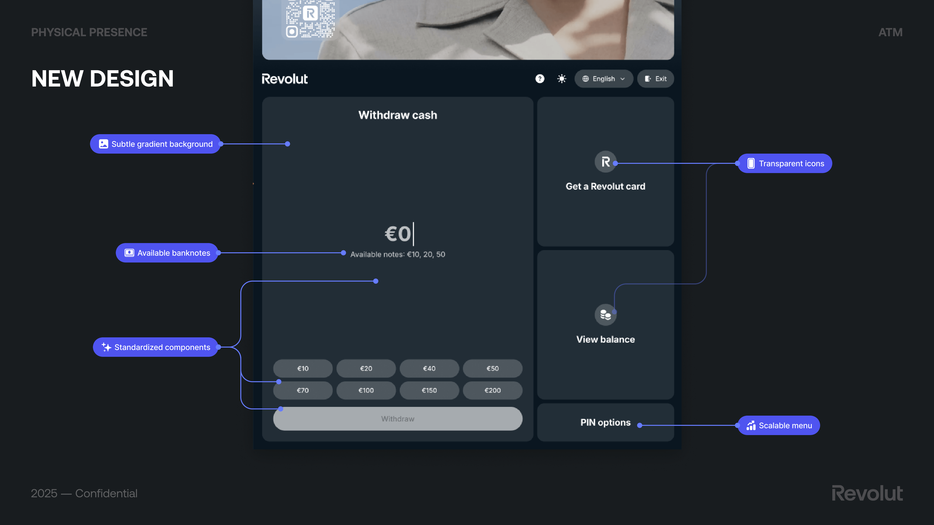
The final design (New design) kept the withdraw flow central and added: subtle gradient background, transparent icons, available banknotes clearly stated, standardized components, and a scalable menu. Preset amounts (e.g. €20–€1,000), Get a Revolut card, View balance, and PIN options completed the supporting actions.
Core flows: auth, withdraw, deposit, overlays
Beyond the home screen, we designed the full journey: authentication (e.g. Sign in with Revolut as the preferred method for Revolut users—practical, fast, and secure), cash withdraw (including Login with Revolut and Account Switcher), overlays available at any time (Language picker, Get support, Exit button so users aren’t forced through an extra step), and cash deposit. We also defined an ads system: a carousel of static, clean creatives with soft transitions so ads don’t distract users performing operations on the bottom half of the screen.
Language for everyone: the picker we shipped
We iterated from v1 to v2 based on usability and stakeholder input: a new overlay style and a new design-system component tailored for ATM screens, aligned with Revolut’s transparent brand direction. We prioritised most frequent languages using Barcelona and Madrid touristic statistics, kept Catalan (stakeholders had suggested removing it; we made the case to keep it), removed flags to avoid sociopolitical concerns (e.g. flag display for English), and made the list scroll-free so most users could choose without scrolling—faster and more intuitive.
Dynamic Currency Conversion: clear and compliant
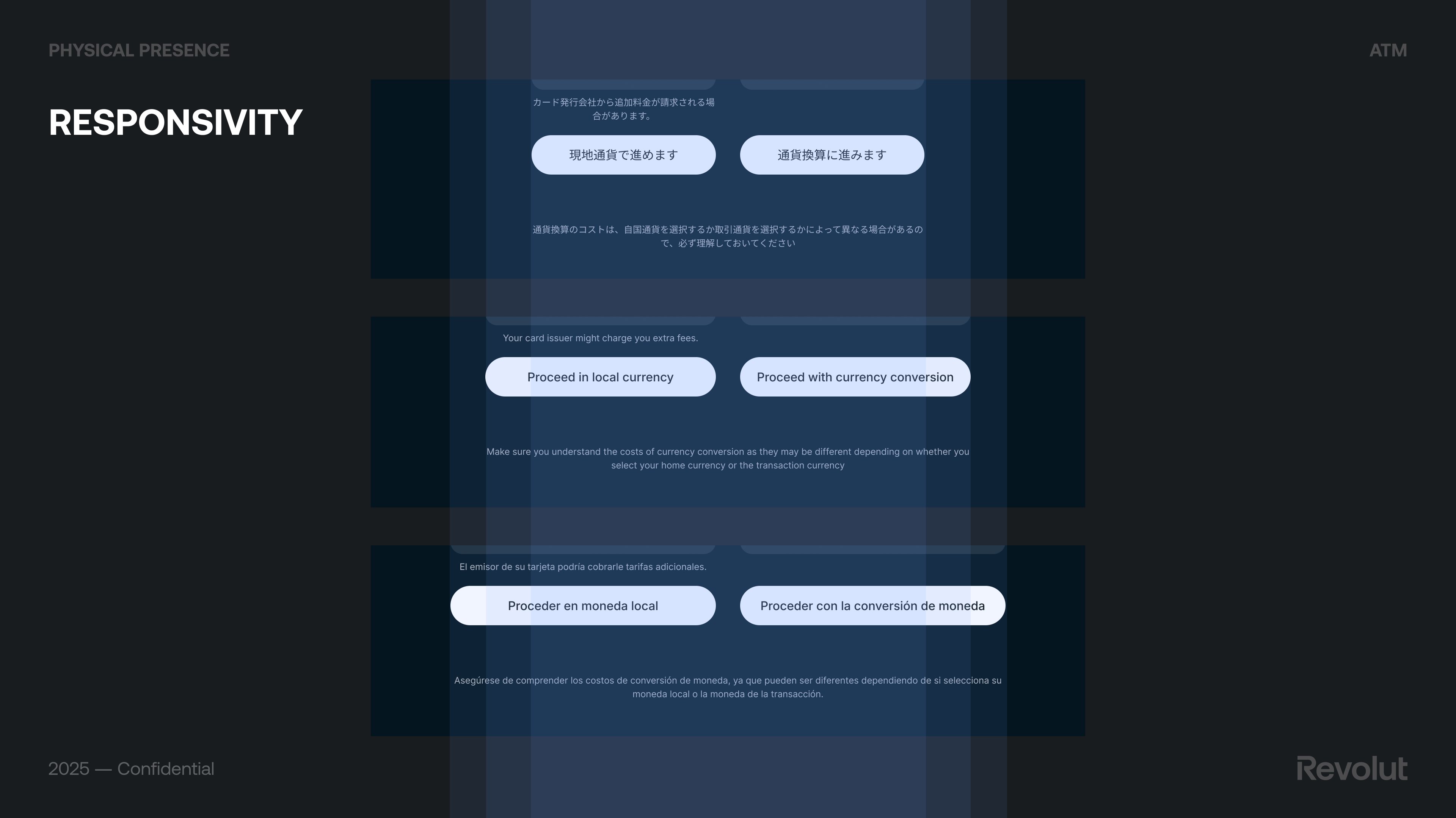
When paying with a card in a foreign country, DCC lets the user choose to pay in their home currency instead of the local one; the terminal shows the amount in their currency. Convenient at first glance, but the rate and fees are often less favorable than letting the card issuer convert—so the user can end up paying more. Visa and Mastercard have strict rules on how DCC must be presented: offer wording, selection buttons (e.g. “Proceed with currency conversion” vs “Proceed in local currency”), exchange rate, mark-up, and fees must all be disclosed clearly and consistently on screen and on the receipt.
Our v1 had an unclear title, missing exchange-rate mark-up, missing fee breakdowns, missing required disclaimer, and a non-compliant nudge. We went through several rounds of scheme feedback (e.g. “Please choose the currency to be charged to your account”, neutral choices, markup on screen, same font size for all disclosures, ATM Access Fee wording, total local currency amount). We explored Screen A (single screen, less steps but crowded, required info not well labeled) vs Screen B (two-column layout per Visa guidelines, more transparent and easy to understand but more steps). The final design met all content requirements and made the choice clear without nudging users toward the more expensive option.
How we benchmarked competitors
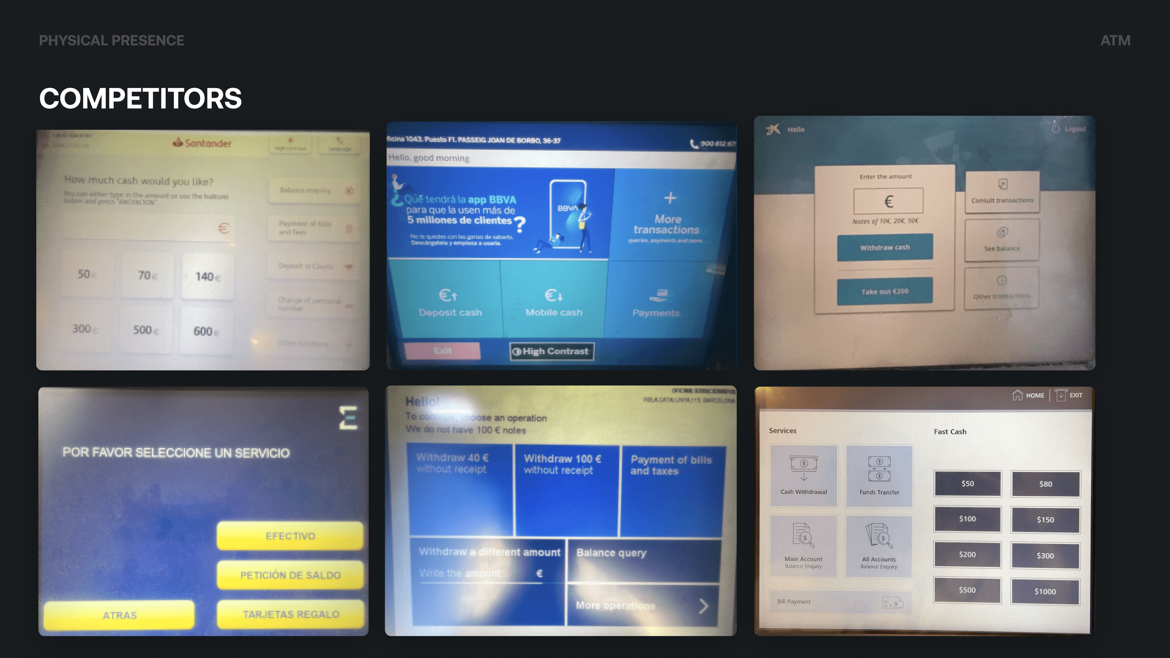
We benchmarked incumbent and digital-first players, including CaixaBank, Santander, Sabadell, Euronet, BBVA, and Tinkoff Bank. We mapped how they handled flows such as general intro, language selection, unauthorised cards, withdraw and deposit cash, collect card, exit session, and loading/performance. That gave us a clear picture of industry norms and where we could differentiate on clarity, transparency, and a mobile-app-like feel.
Testing with real users
Why research mattered
This was a large initiative for Revolut and a move into unknown territory. Running regular research and folding insight into development helped ensure we built something that met user needs, was innovative and easy to use, and didn’t require heavy rework post-launch because of missed UI/UX issues.
What we tested and how
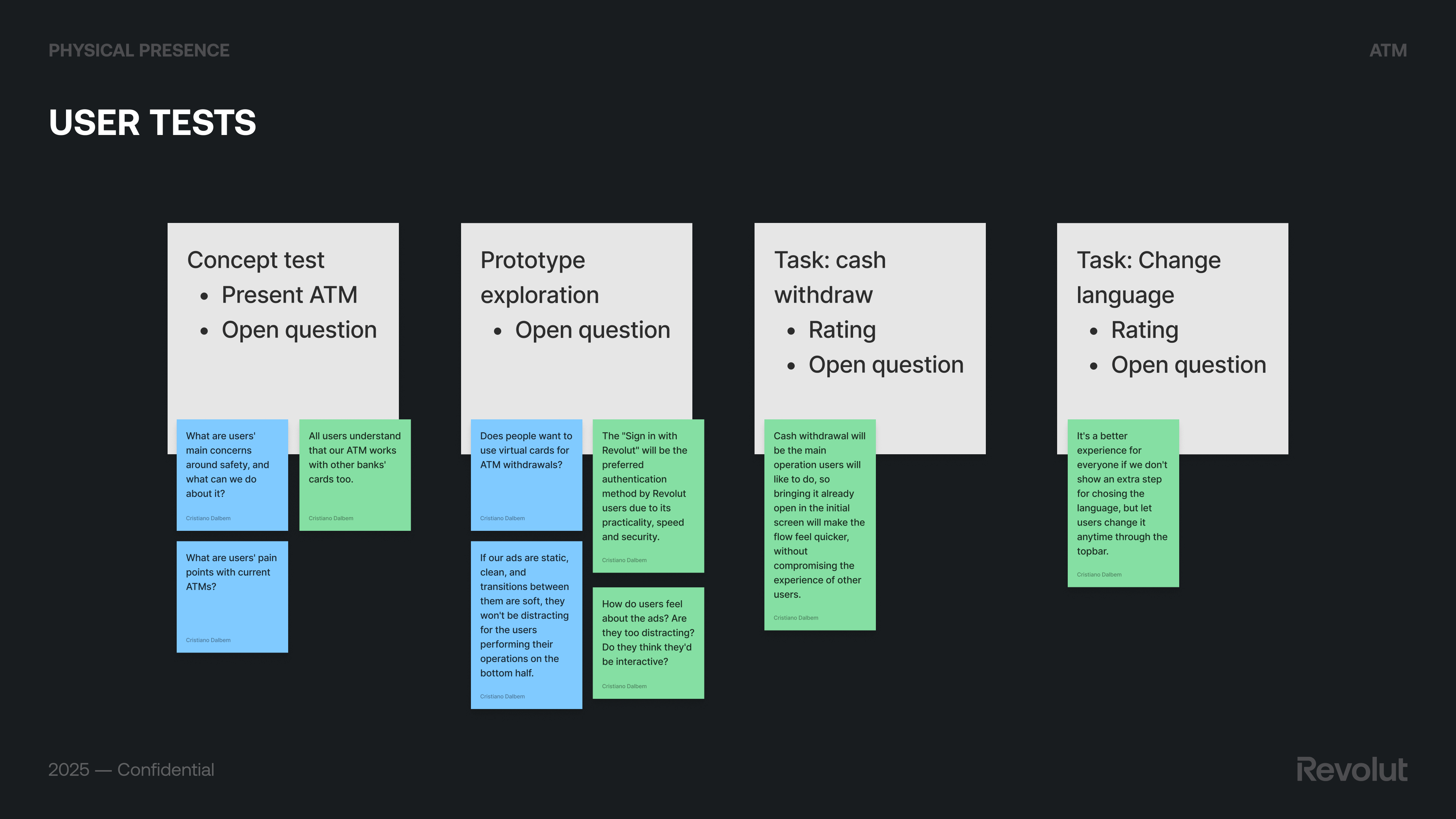
We ran user tests with a mix of concept tests (e.g. “What are users’ main concerns around safety?”), task-based scenarios (cash withdraw, change language), and prototype exploration (e.g. virtual cards for ATM withdrawals, preference for “Sign in with Revolut”). Key takeaways: users understood that our ATM works with other banks’ cards too; bringing cash withdrawal already open on the initial screen made the flow feel quicker; letting users change language anytime via the top bar was better than an extra step; and static, clean ads with soft transitions weren’t distracting. We used Maze for unmoderated research to run tests quickly and at scale.
Results and changes we made
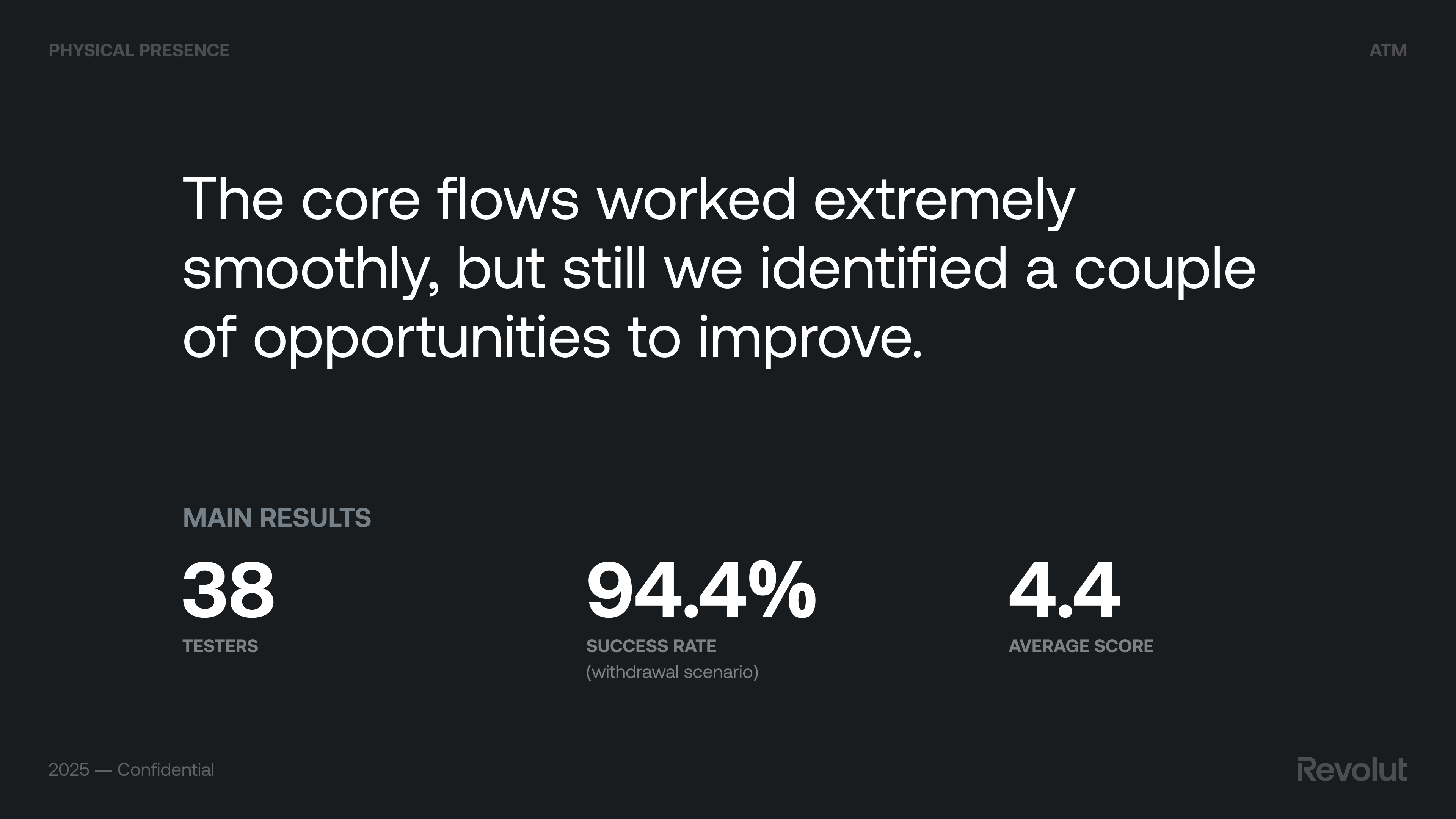
Core flows worked very smoothly; we still identified opportunities to improve.
Positive: intuitive and user-friendly, attractive and cohesive design, fluid performance. Neutral: prototype-specific issues (scrolling, zoom, some buttons in Maze). Negative: ads were noticed (with minor improvement suggestions); automatic session closure after an operation caused frustration.
Changes we implemented: a privacy layer and accessibility settings where possible; improved receipt experience (making it clear that the phone number for SMS receipt is optional). Session management (keeping the session open after one operation) wasn’t technically possible at the time.
Running the network
The backoffice
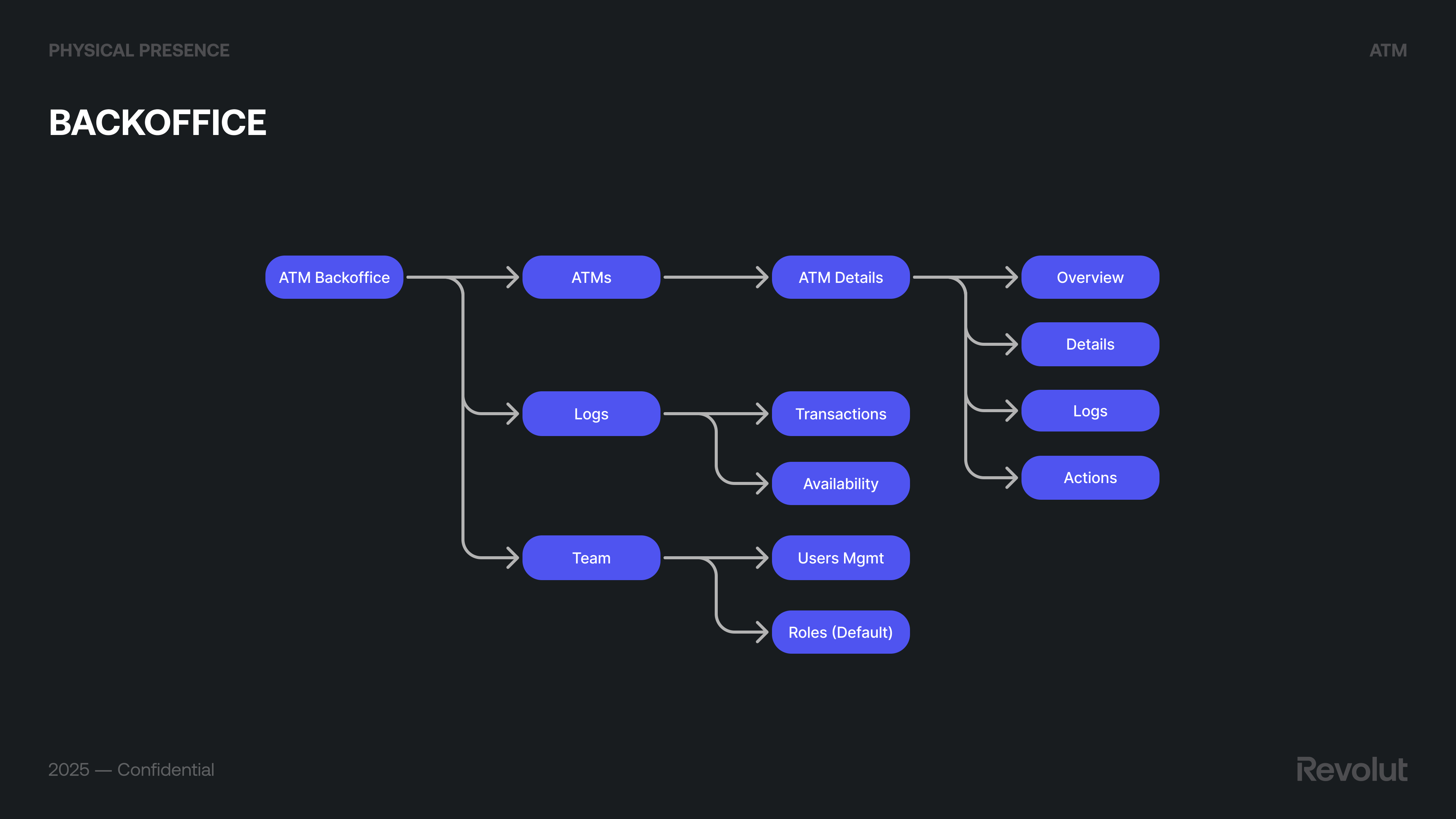
We worked with the vendor’s ATM management system (Monimanager) and designed Revolut’s ATM Backoffice on top: ATMs list and ATM details (Overview, Details, Logs, Actions), Transactions, Availability, Users management, Roles (e.g. default team roles), main dashboards, and user management. This gave ops and support a single place to see machine status, handle incidents (cash levels, connectivity, errors), and configure settings. Future improvements (e.g. richer analytics, automation) were scoped so the product could evolve without losing clarity for day-to-day operations.
App and beyond
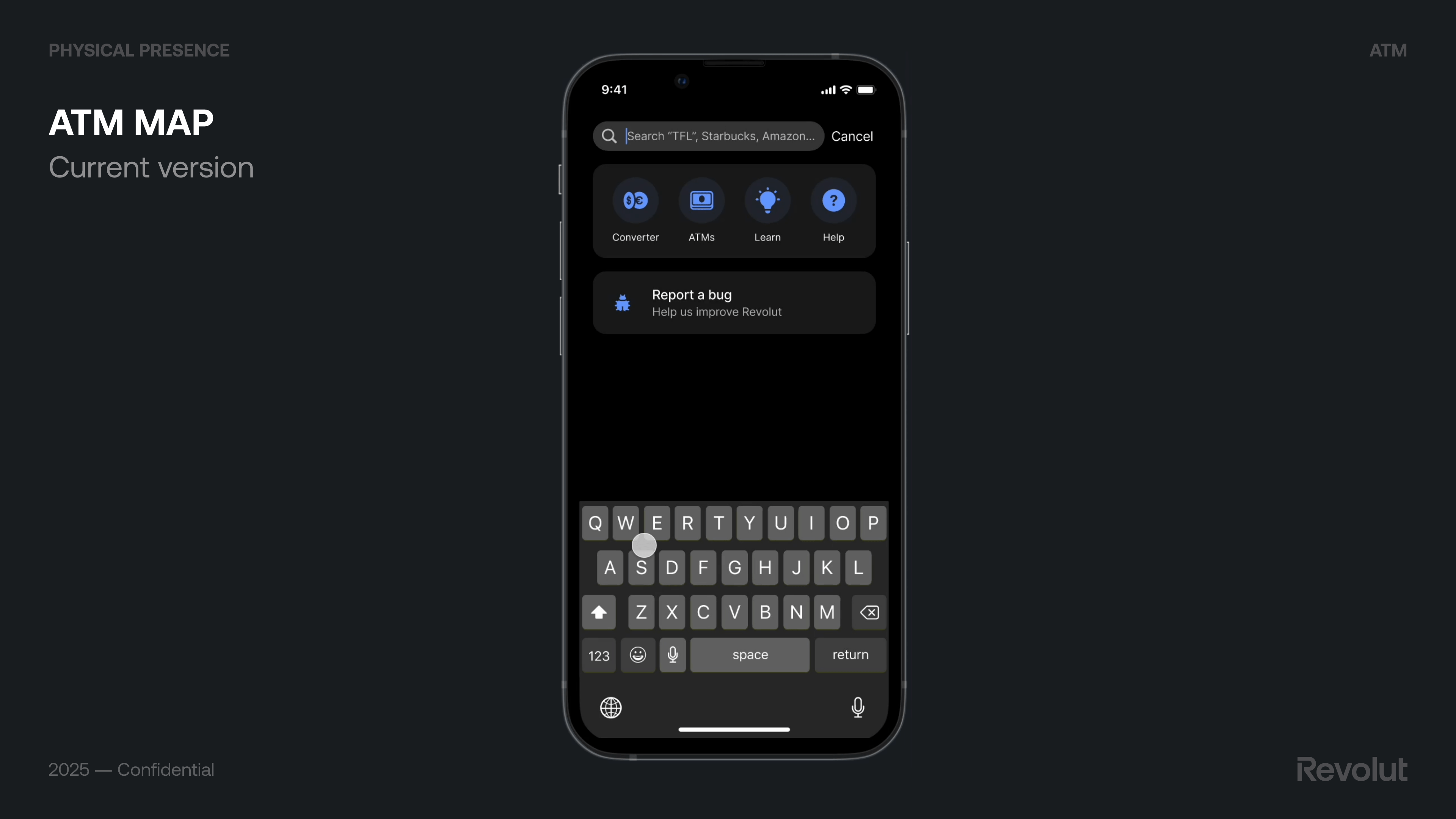
We aligned app changes with the ATM launch: ATM map (find machines), card activation from the ATM, and SSO login so the experience felt continuous. We also explored accessibility settings (e.g. privacy layer on screen) and future directions: Face ID as identification (not only authentication), numeric vs alphanumeric keypad (numeric for PIN on screen vs physical keypad trade-offs; alphanumeric for scenarios like receipt by email but with trade-offs on typing and time), and ATM survey to keep learning after launch.
Outcomes
The product went live in Spain with a focus on brand trust, withdrawal fee revenue, and activation rate. Success on these metrics supports the case for rolling out to more countries and expanding the range of services on the machines.
Main learnings
The sum of the parts is greater than the whole
Standing on the shoulders of giants
Keeping the mind open
See more
This case study leveraged generative AI technologies to help extract key insights from years of extensive project documentation I created. It also helped me suggesting improvements to the writing. All AI-generated content was thoroughly reviewed and manually edited before publishing.
"Computers are like a bicycle for the mind."